415-595-5348


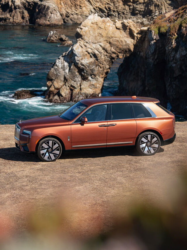
Automotive photo shoot for Rolls-Royce featuring the Cullinan SUV, Phantom saloon, and Spectre coupe cars at locations in Monterey, Carmel, and Big Sur, and Felton California.
Continue Reading
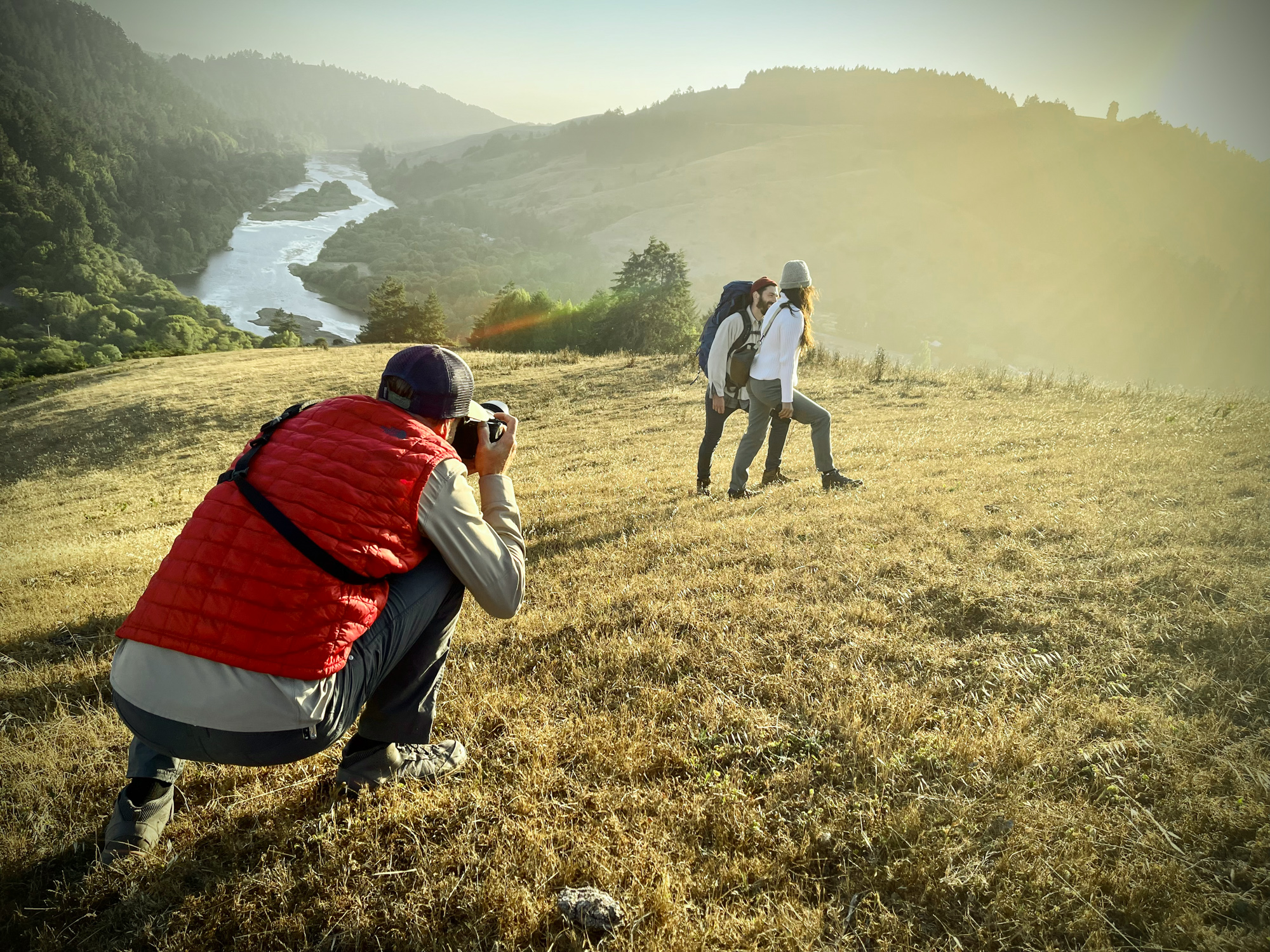
Photo gallery of client selects and outtakes from a product lifestyle photo shoot and hiking adventures on the Russian River in Northern California for Nikon USA. Continue Reading
Photo crews have adjusted to working under covid-19 guidelines, and commercial photographers are required by law to meet local safety measures. Here are the options and protocols I’ve been sharing with clients and crew during this time: Continue Reading
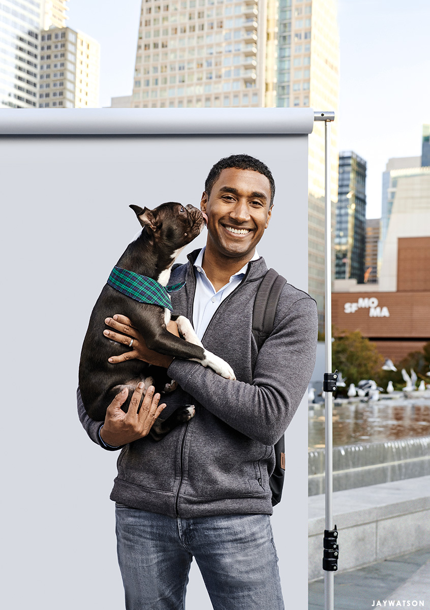
An editorial portrait of Andre Charoo at the Yerba Buena Gardens shot in downtown San Francisco for Past & Present Magazine, the alumni magazine of Crescent School (Toronto) Continue Reading
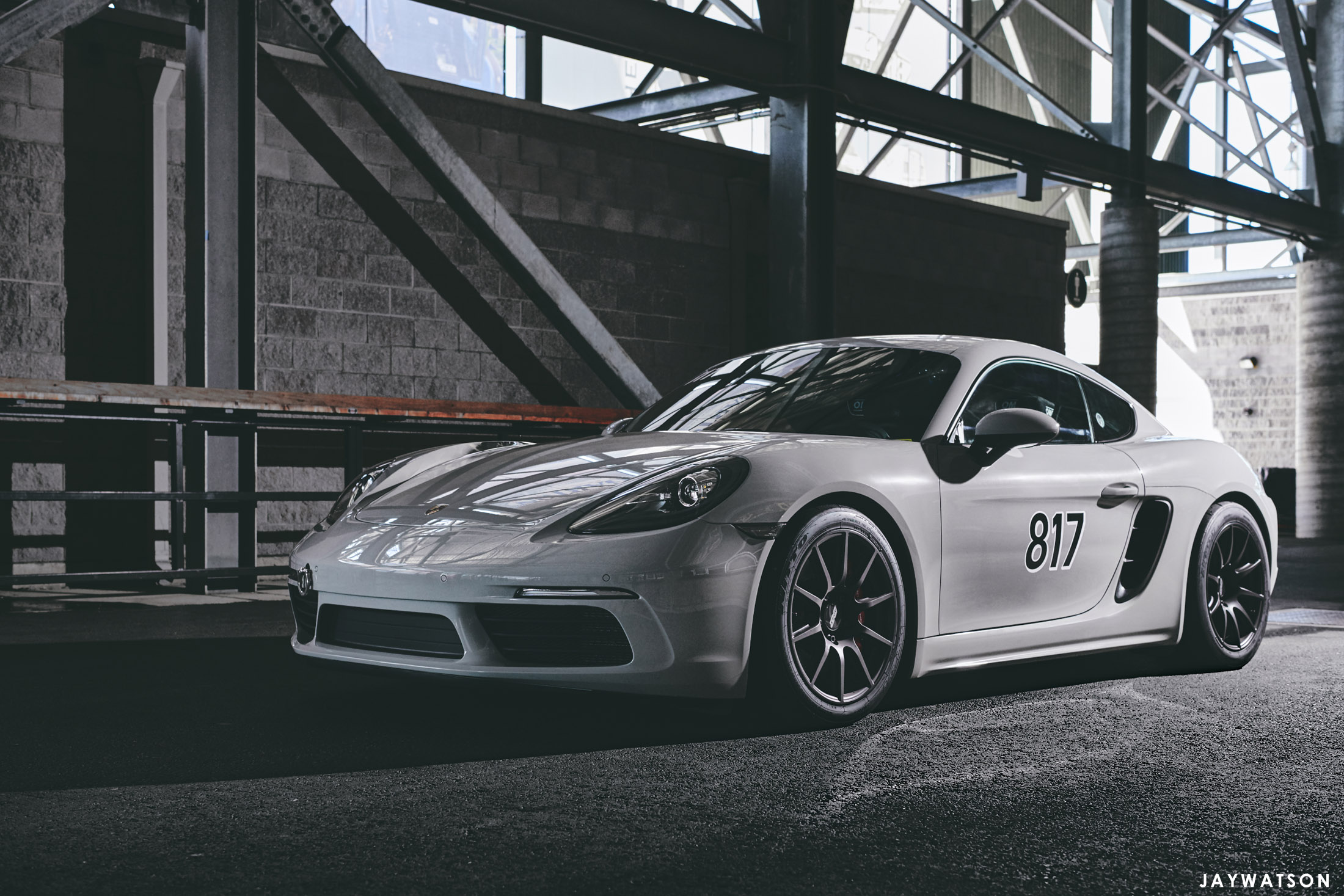
A day at the track with favorable weather and a chalk grey Porsche Cayman is a day that I thank the photo Gods for allowing me to be a photographer. Below is a gallery of images from an assignment covering driver Ed Sporbert and his 2018 Porsche 718 Cayman S at Sonoma Raceway for Apex Wheels. Continue Reading
After years. And years. And years. I finally sat down and created a portfolio of motorsports and automotive photography. This collection comes from some playoff-level assignments shot for various clients including: Audi sportscar experience, Mercedes-Benz, Motorcyclist Magazine, Porsche, Simraceway, and more. There will certainly be new trophies added and replacements to the portfolio over time. So far these are my all-stars. Continue Reading
I contributed to a post on PhotoShelter along with 4 other lifestyle photographers sharing career lessons and advice. The photo industry has changed greatly since I first started. With that in mind, here are (4) tips I would have told my younger self. Continue Reading
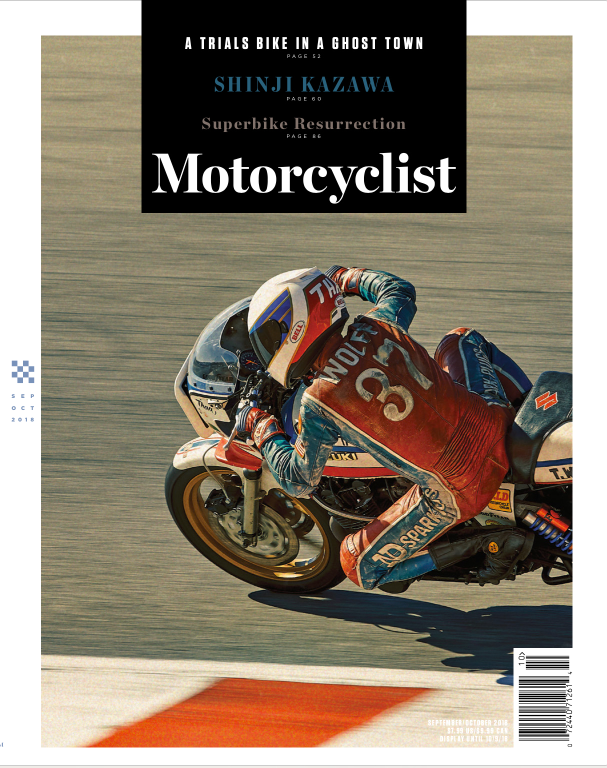
Photo shoot with former AMA pro racer Thad Wolff for the cover of Motorcyclist Magazine during the FIM Superbike World Championships at Laguna Seca. It was a day with high temps, a bit of luck, gratitude, and oil stained boots. The feature is about Thad’s relationship with a Suzuki GS1000 bike, and his friendship with the innovative guru mechanic Matsu Matsuzawa. Continue Reading
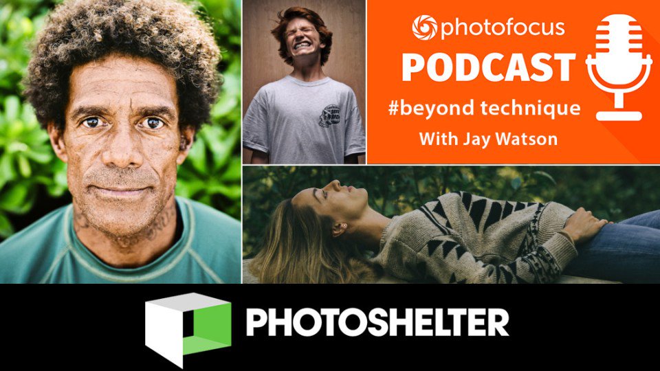
I was interviewed on the photography podcast Photofocus “Beyond Technique” by hosts Chamira Young and Skip Cohen. It’s also a decent discussion about the photo industry. Skip and Chamira asked about staying focused, self correcting the career path, how I got started in photography, and how to break into lifestyle or editorial work. They wrapped… Continue Reading

PhotoShelter announces “The List” – the top 90 photographers on the platform from over 80K members. San Francisco based photographer Jay Watson is selected as 1 of 5 photographers chosen to represent the lifestyle category. Continue Reading
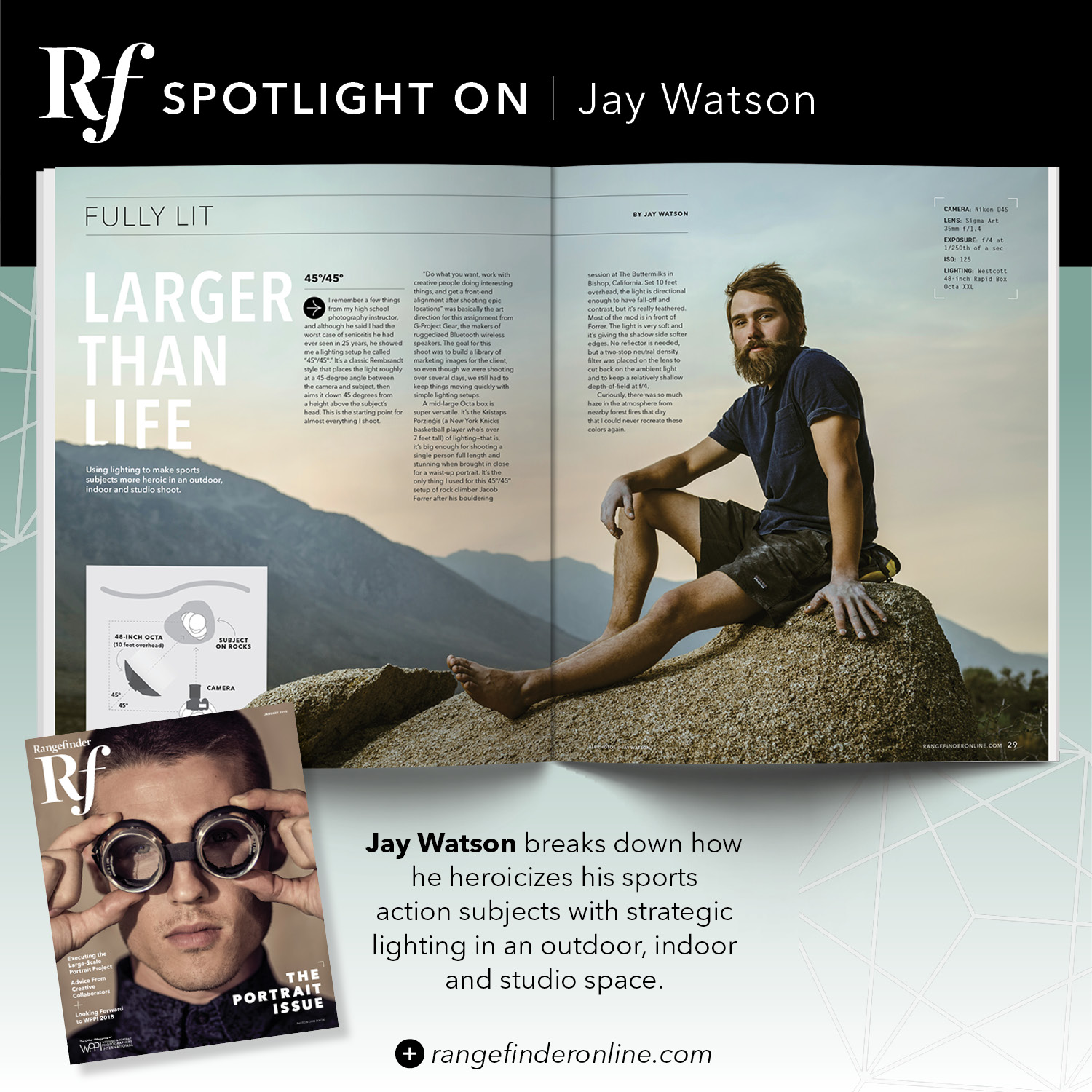
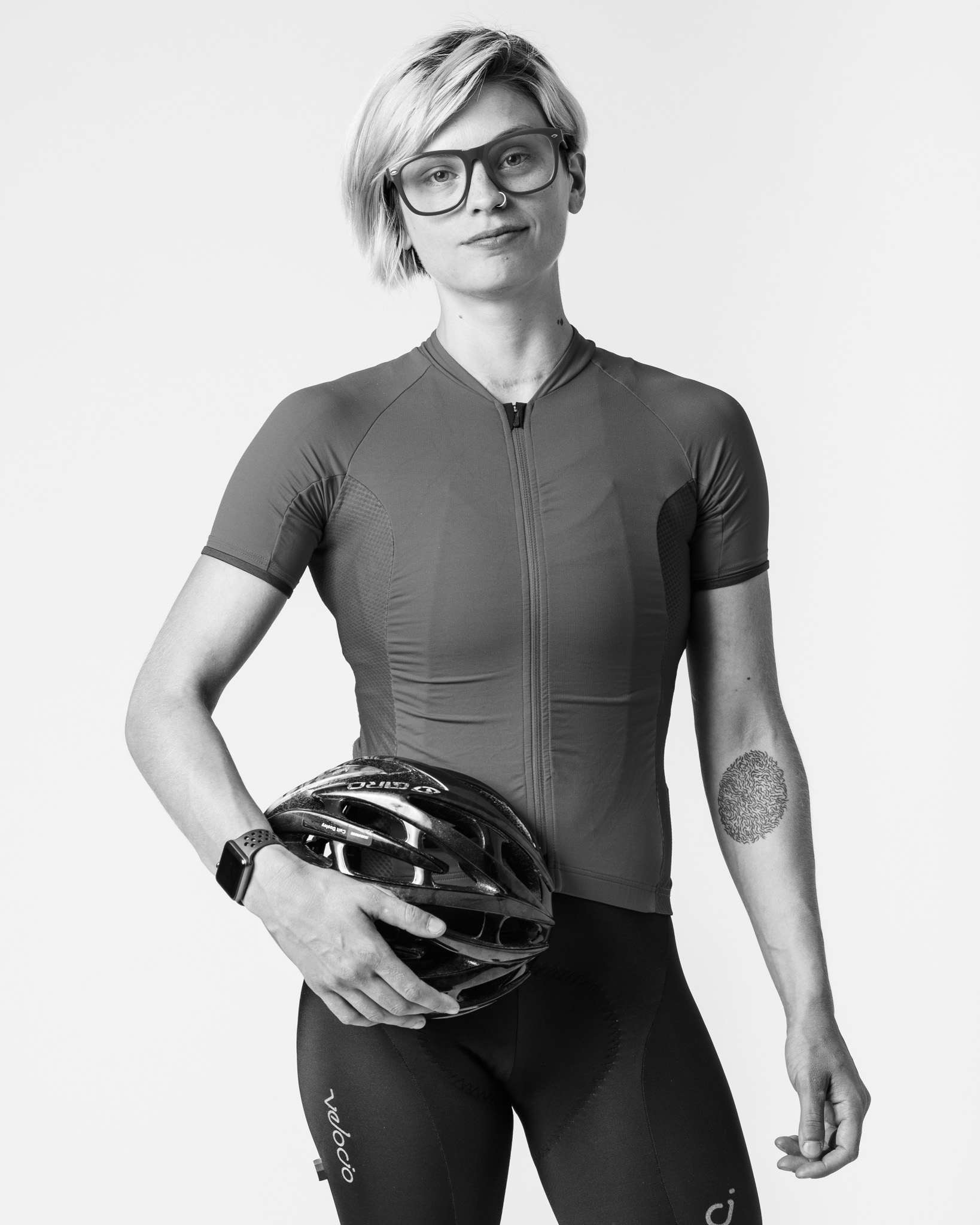
Lighting tutorial “Fully Lit” in Rangefinder Magazine from (3) sports subjects – an outdoor scene of a rock climber at Mammoth Lakes, an indoor location set for a sportswear client, and an editorial studio portrait of a pro cyclist. Continue Reading
Ducks, hens, and ribs. Here is a promotional video we shot with Chef Trent Page showcasing a rib roast, spiced duck, and a mustard herb game hen available at Whole Foods Markets in Northern California. Despite not wanting to be in front of the camera, Trent helped us knock out (4) videos in only a… Continue Reading
Sometimes we meet people for a reason. The morning I was scheduled to photograph pro racer Peter Stetina in Santa Rosa, CA for a Bicycling Magazine feature called “These Legs Were Made For Cycling,” I was rear ended in an accident and totaled my truck. Peter’s story for the piece is about his recovery during… Continue Reading
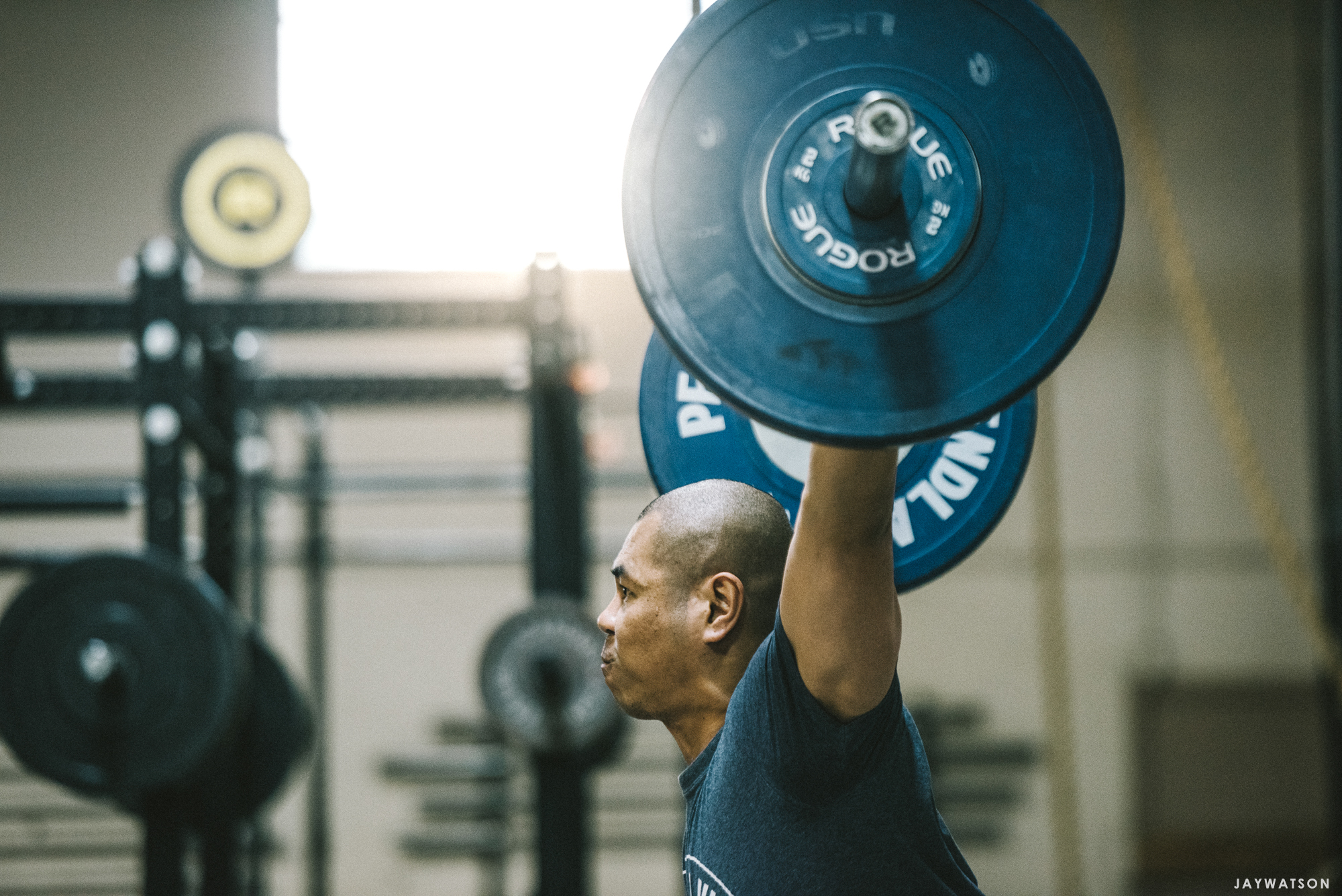
Photo gallery of athletes working out at CrossFit Vis Performance gym in Belmont, CA Continue Reading
Video of fly fishing and rock climbing with the Forrer Brothers at Mammoth Lakes, CA. From an adventure, travel, and lifestyle series for G-Project Gear Continue Reading
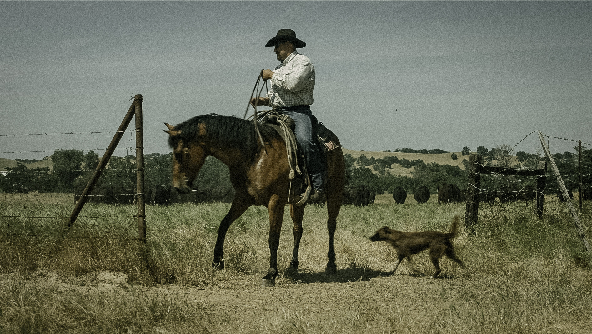
Whole Foods Market sent us to Pete’s Valley Cattle in Winters, CA with Chef Melissa King – to film ranchers Rick Harrison and Richard Stewart and to learn about their partnership with Panorama Meats. Here is our finished 3 minute video edit from the project. Continue Reading
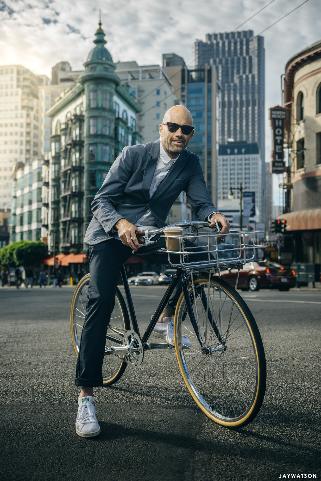
Editorial photo shoot of Vaughn Brown of Parker Dusseau Menswear photographed in San Francisco, CA for Bicycling Magazine. Continue Reading
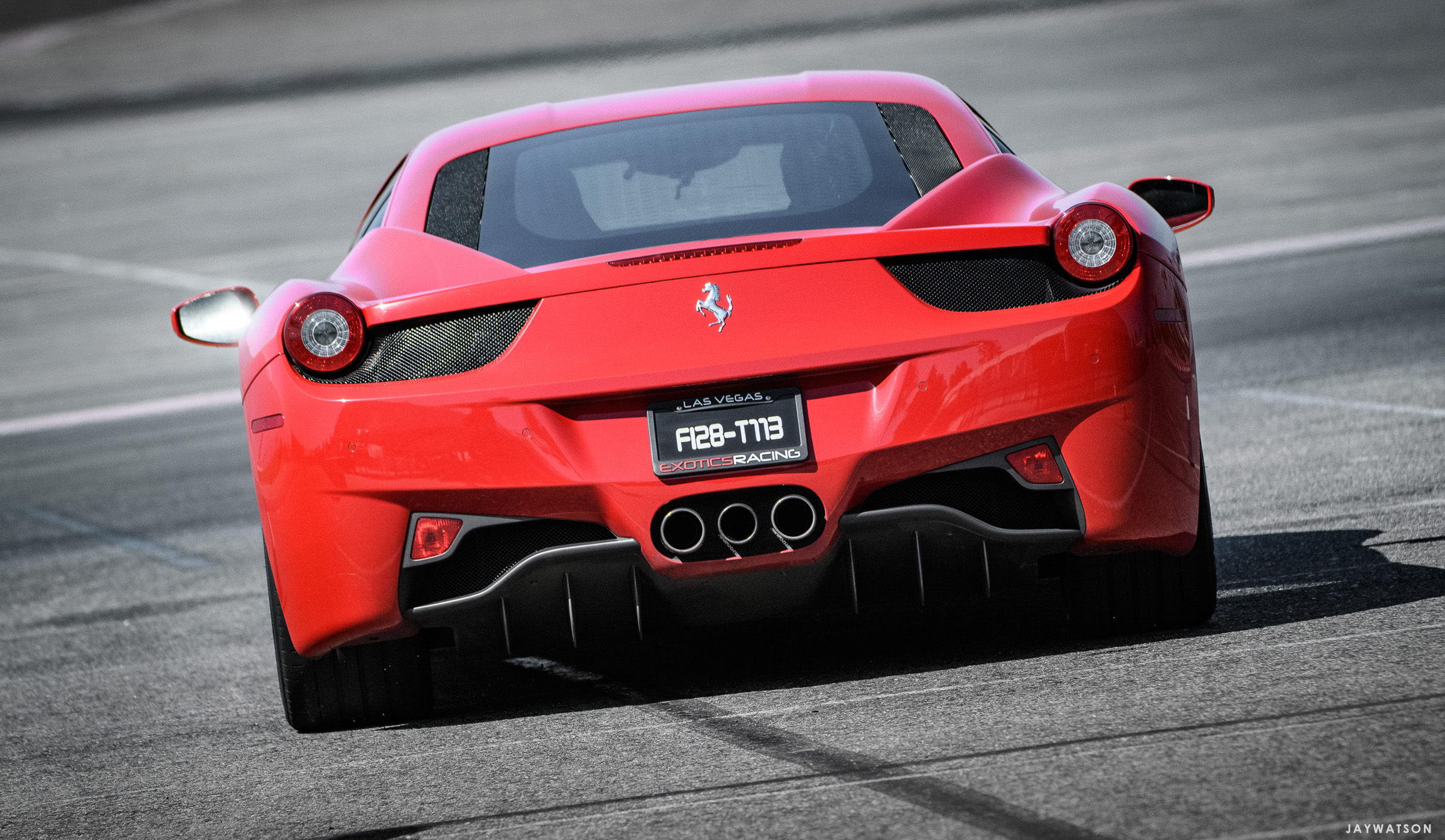
Automotive photos of drivers and supercars from Exotics Racing driving program at Los Angeles Auto Club Speedway, and photographed for Hydrofarm. Continue Reading
Photo District News interviewed me for a short piece about my photography, California culture, and how I use my website. The article is sponsored by Photoshelter, the company that hosts my online portfolios, image archive, and work for client delivery. Continue Reading
A 3 minute video shot for Whole Foods Market of lamb rancher and conservationist Joe Pozzi in Valley Ford, CA with Chef Melissa King. Continue Reading
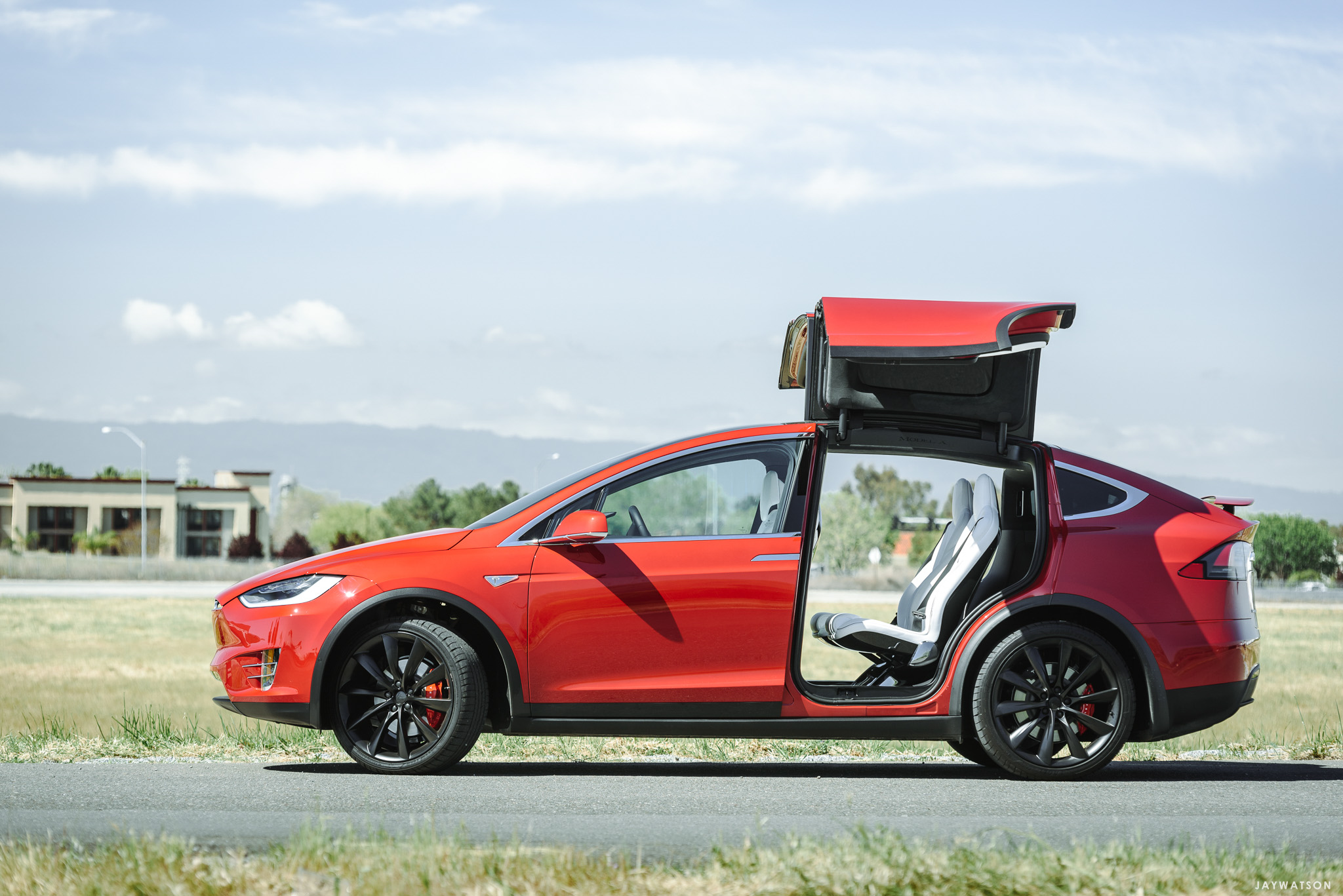
An editorial gallery of automotive images from a photo shoot at the Tesla factory in Fremont, CA for Lufthansa Magazine. The story and photos cover the robots used at the Tesla factory to assemble the luxury SUV Model X car. Continue Reading
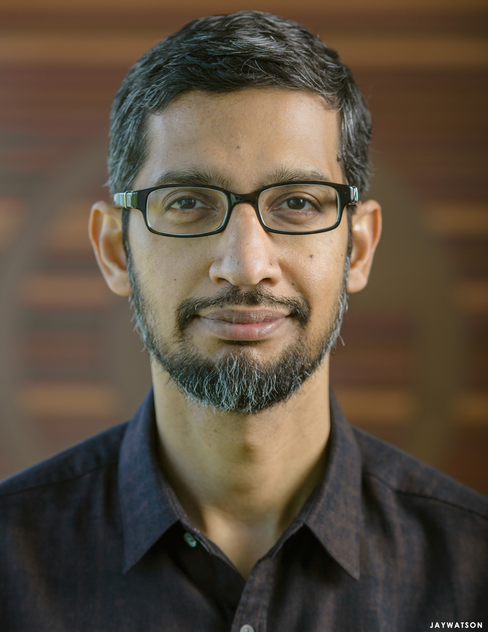
“You’ll only have 15 minutes,” said the PR person on the phone who was in charge of keeping Google CEO Sundar Pichai on schedule during my upcoming photo shot for The Telegraph (UK). Okay. Got it. So what do you do? Continue Reading
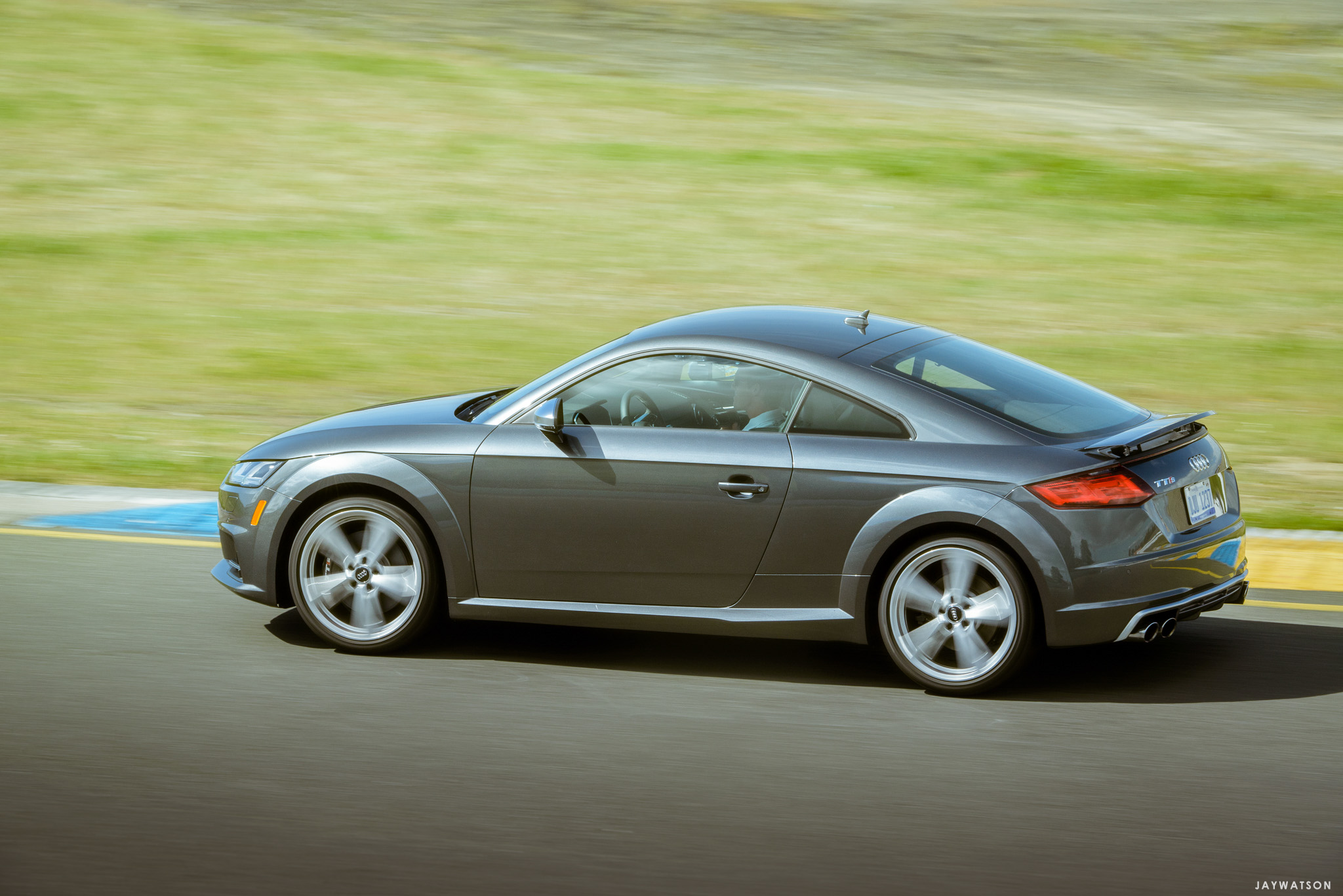
Photo coverage of Audi cars used in the Audi sportscar experience driving program at Sonoma Raceway with members of San Francisco’s club – The Battery. Motorsports work of auto cross, driving instruction, and various spots on track. Continue Reading
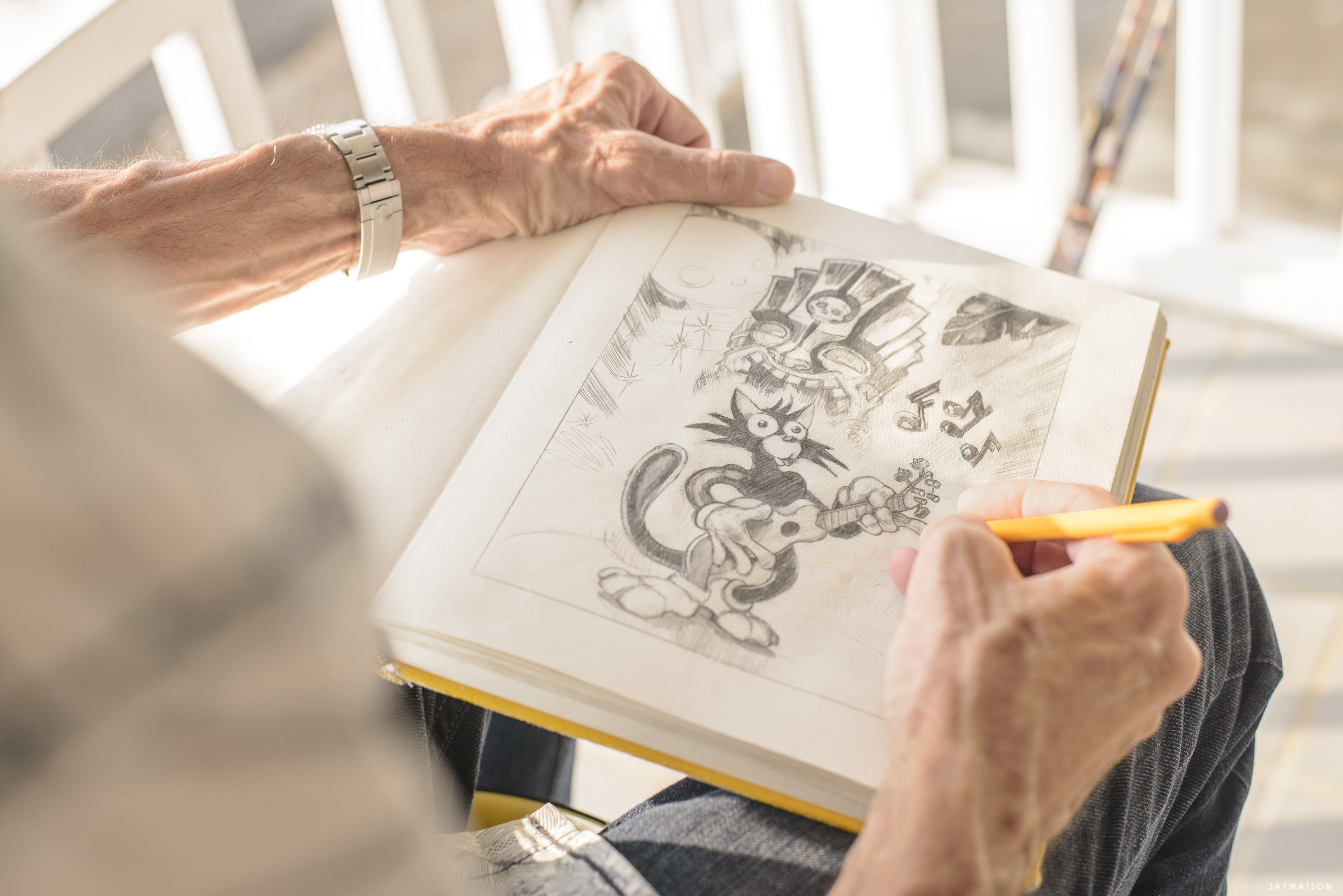
Outtakes from an editorial portrait shoot with tiki artist Brad Parker of Kona, HI for Hana Hou! Magazine Continue Reading
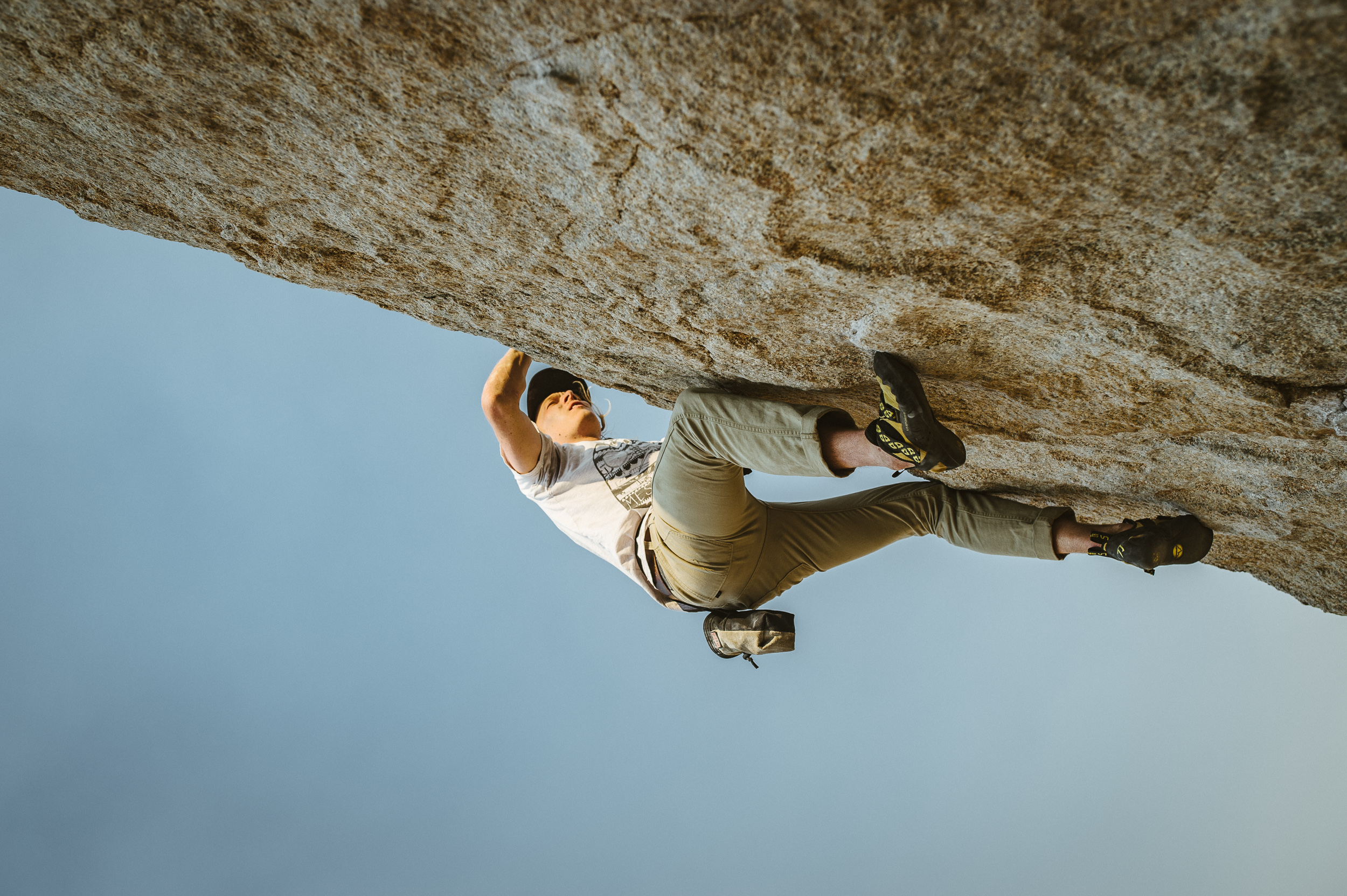
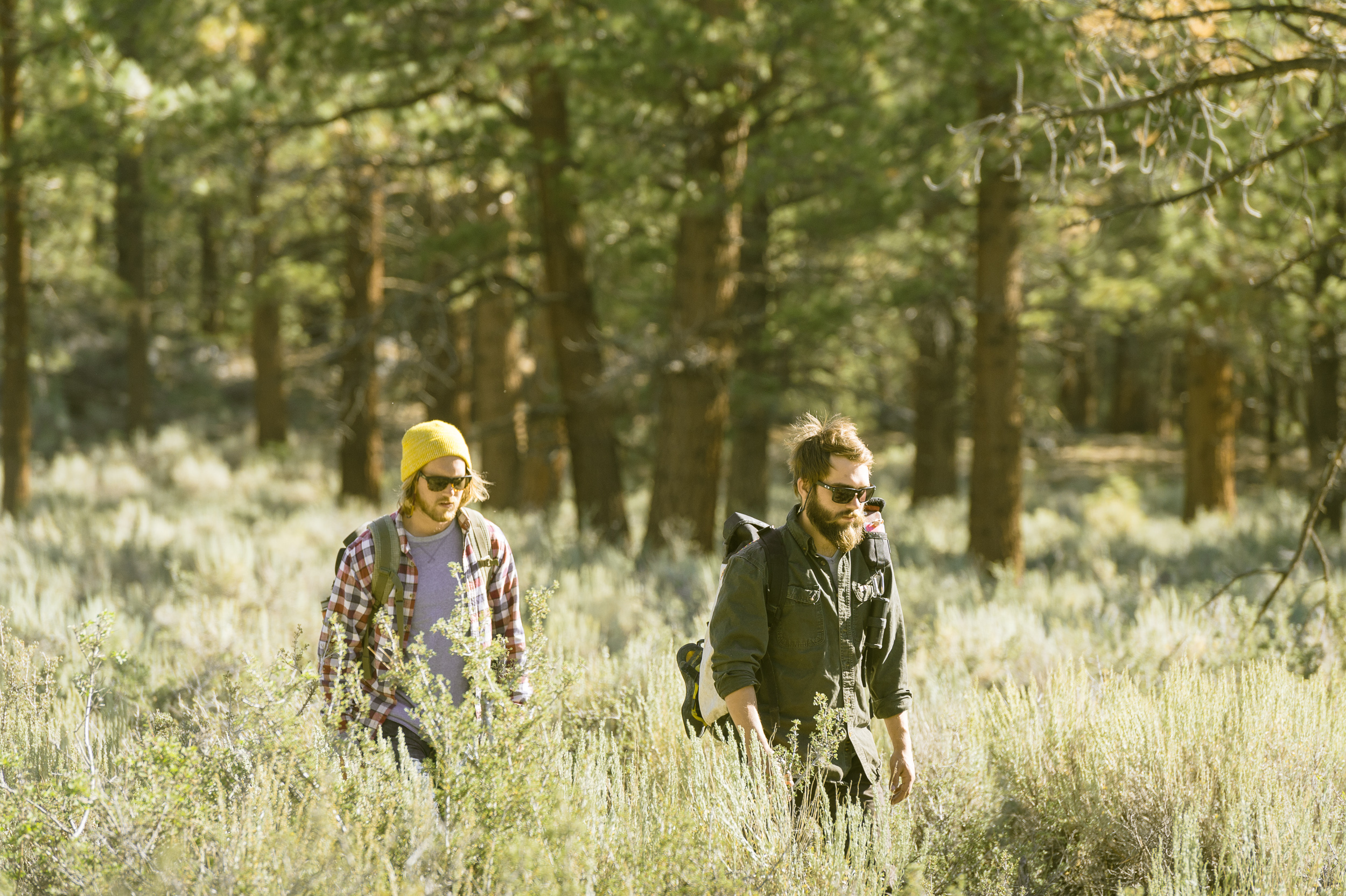
Selects and behind the scenes photos from the adventure lifestyle and rock climbing series with Michael and Jacob Forrer of Repurposed Grain at Mammoth Lakes and Bishop, CA. Shot for G-Project Gear. Continue Reading
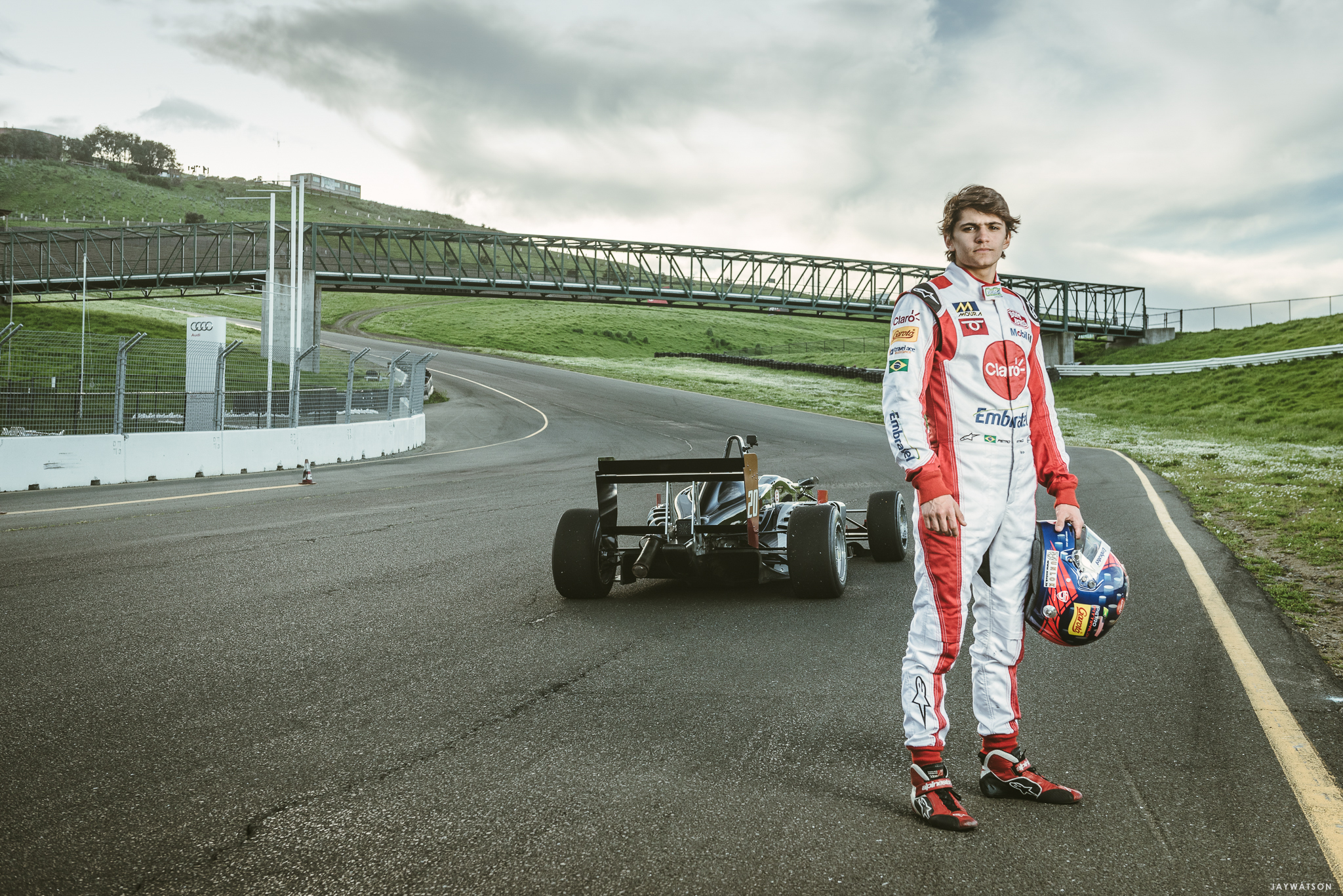
Coverage of 19 year old Pietro Fittipaldi, grandson of the legendary driver Emerson Fittipaldi, for Motorsport.com breaking the Formula 3 lap record car at Sonoma Raceway. Continue Reading
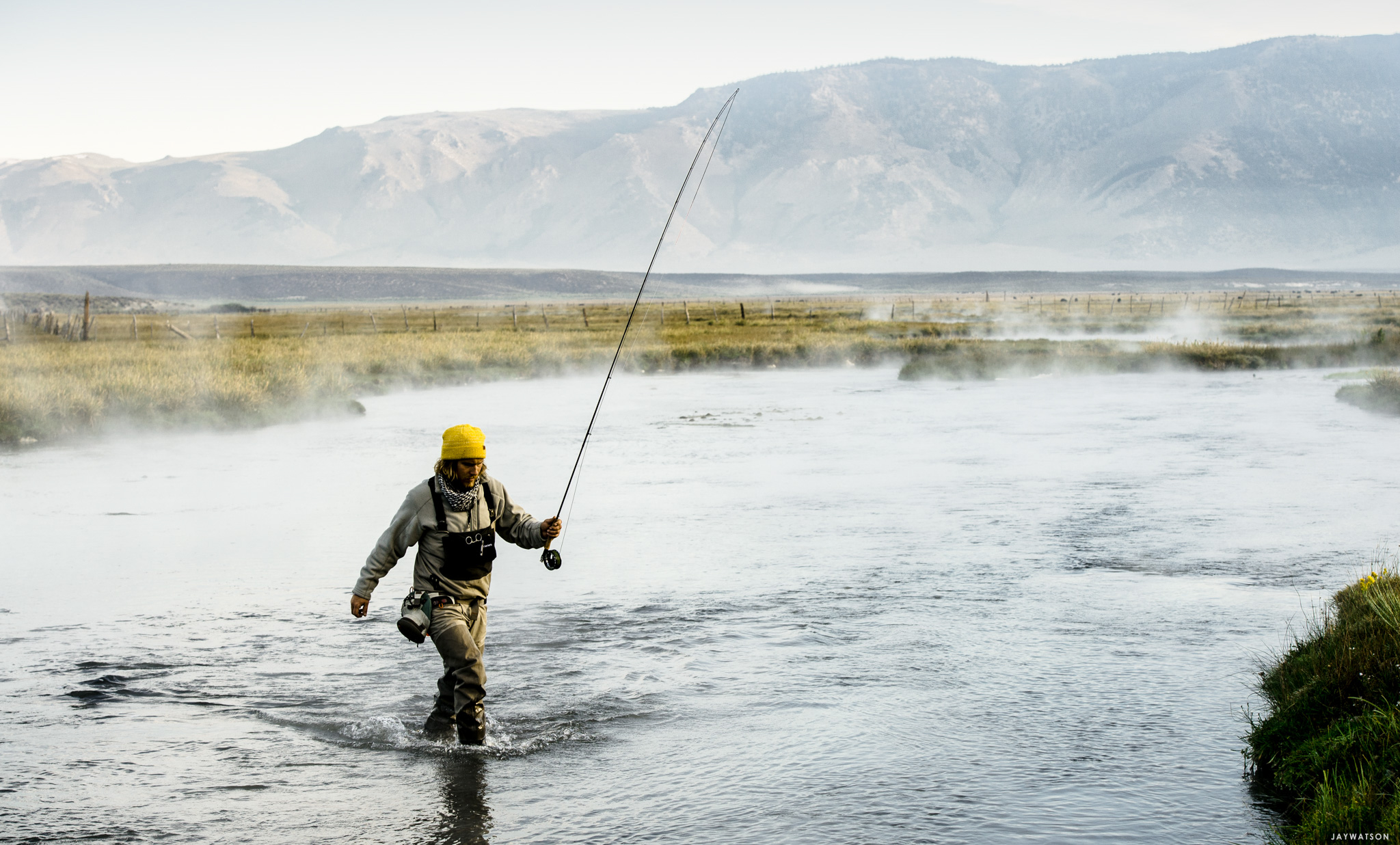
Selects and behind the scenes photos of fly fishing with the Forrer Brothers at Mammoth Lakes, CA. An adventure, travel, and lifestyle series for G-Project Gear Continue Reading
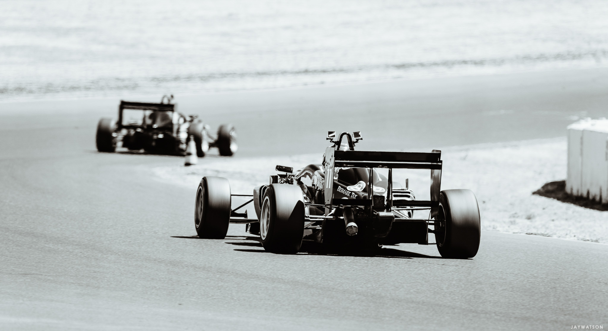
Video and photo coverage of formula 3 racing at Sonoma Raceway during the Jim Russell F3 Racing Series by Simraceway. Continue Reading